 Every year color trends are announced…for fashion, for cars, for residential design. I’m always very curious about these. One, I wonder about the process of determining these trends and two I like to see how I’m doing, as a designer, in staying with or ahead of the trends.
Recently I attended a presentation on color for 2009/10 by one of the large paint manufacturers. The parent company of said paint manufacturer has a division that researches and determines color trends for everything from the fashion industry to airlines and car manufacturers to their very own paint. Without going into too much detail, they look at many cultural, political and social influences to determine what we will want in the coming years. It is probably no surprise that most trends, color and otherwise start on the runway. Yes, fashion designers lead the way. From the time designs are shown during Fashion Week, it is 6–12 months for those designs to hit the stores. It is then another 3–5 years for those trends to translate into residential design.
So where are we headed? In the post-911 period, were cocooning, we wanted colors that were soft, safe and comfortable. This was the time of pink and chocolate brown. 2 years ago were gong out more, feeling more confident and secure. Colors started getting brighter – lots of oranges, bright greens and yellows. Today we are anchoring, we feel insecure…the world around us is uncertain. We are watching romantic movies and spending our hard-earned dollars on small luxuries. So for the next couple of years our colors will be grounded in the earth and looking to the sky. We want to feel terra firma supporting us, yet we are looking forward, upward – toward the next phase.
How does all of this translate into our homes? Four basic trends emerge…
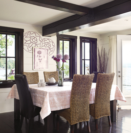
 • Earth: we are grounding ourselves in the basics. In this case looking back to industry…basic machinery, standard materials and true craftsmanship. The palette is made up of patinaed browns, industrial blues and greens. They are sturdy and honest. And connecting with our life’s journeys – spiritual, cultural, philosophical. It is a blending of urban, tribal and mixed-cultural references – rich earthy tones that can stand alone or be accents against saturated browns and inky blacks.
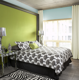
• Sky: we are exploring fantasy. There is a blend of contradictions – ornate/minimal, modern/vintage, classic/neo-classic. The palette is romantic and dreamy – warm pinks and violets anchored by rich browns. And stepping into the virtual world…a cartoonish, fantastic version of reality. The colors are clean shades of green, yellow and blue stabilized by black and white.
Much of we are seeing in these “new” palettes isn’t new at all. We’ve seen these colors before. What is new is the interpretation and the way we use them – the saturated greens and blues are being balanced with black and white. The soft romantic tones are grounded with rich browns. Each of us will interpret these trends in our own way. The particular shade of color with the chosen accents and furnishings.
As always, stay true to who you are and your own aesthetic. Trends are exactly that…trends. They are forever changing and morphing. Don’t get too caught up in having to have the latest.
Recent Comments