We’re all watching our pennies these days…thinking two and three times before making any discretionary expenditures. Yet making our homes more comfortable and attractive will help us feel better as we weather these challenging times. So here are my top 10 ideas for spiffing up your space without breaking the bank.
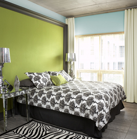
 1. Paint: You’ve heard me say it before…there is no faster easier way to get dramatic change in your home than new wall color. Without a doubt the biggest bang for your buck.
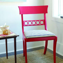
2. Refinish worn pieces: If you have some tired furniture, a fresh coat of stain and varnish can breathe new life into the most tattered of pieces.
3. Recover or replace old lampshades: This is an easy way to add some spalsh. Recover your existing shades with a bright, bold pattern or trim. If that intimidates you, purchase new shades at any store that sells lighting.
 4. Reupholster: You love you grandmother’s chair, but the upholstery screams “old lady”. Have it recovered in a bright new fabric and viola…instant fabulous! Consider an animal print or a really vivid color…bright yellow or hot pink…not only will it add punch to any room but it’s unexpected.
5. Change the shower curtain, towels and accessories in your bathroom…you can have a new room for less than $100.
6. Rearrange your furniture: We all get so accustomed to seeing our furniture in the same arrangement, it’s hard to imagine it any other way. Truth is, most rooms will accomodate more than one floor plan. Try looking at your room as if seeing it for the first time, without attachment or emotion. Then rearrange, you’ll think you have all new things!
7. Add an area rug: A bold stripe or graphic rug will update your space quickly.
8. Repurpose: Get creative. Is a door always a door? Can it be a table top? A great piece of ironwork can become a beautiful piece of wall decor. Wire a ceramic vase into become a lamp (most local lamp stores sell supplies and/or will wire it for you.) Most everything can be used for another purpose, it just takes a little creativity.
9. Buy used: Now more than ever you can find amazing deals at garage sales, consignment shops, flea markets, salvage yards and online sources like Craig’s List and ebay. It takes some time, but the rewards can be huge. Remember what I said earlier about refinishing, reupholstering and repurposing.
 10. Add a punch of color: Paint a piece of furniture a bold color, add some accent pillows or a collection of objects. If it’s bright and unexpected, you’ll look like a design genius.
Most importantly, have fun. Do you have other budget-stretching decorating ideas? I’d love to hear them.
 Every year color trends are announced…for fashion, for cars, for residential design. I’m always very curious about these. One, I wonder about the process of determining these trends and two I like to see how I’m doing, as a designer, in staying with or ahead of the trends.
 • Earth: we are grounding ourselves in the basics. In this case looking back to industry…basic machinery, standard materials and true craftsmanship. The palette is made up of patinaed browns, industrial blues and greens. They are sturdy and honest. And connecting with our life’s journeys – spiritual, cultural, philosophical. It is a blending of urban, tribal and mixed-cultural references – rich earthy tones that can stand alone or be accents against saturated browns and inky blacks.
 There is so much talk about “green” products it’s almost impossible to know what to believe or where to start. One of the easiest ways for any of us, design professionals or not, to do what’s best for our environment and our health is PAINT. Virtually every paint manufacturer has a Low-VOC formula or two and there are a handful of Zero-VOC products available.

 There’s a lot of talk out there about gray being the new wall color – replacing white as the neutral. Well, there are grays and there are grays. Where you live – the landscape and climate – will determine what gray – warm or cool; light, medium or dark will work in your home. For example if you live in a climate that has cold winters, or predominately gray skies you’ll want to choose a warmer tone. If you live in a sunny climate or a coastal area, a cool gray might be a better choice.
Recent Comments